Webex Account and Settings
A connected suite of hybrid workflow apps with a centralized profile experience.

A connected suite of hybrid workflow apps with a centralized profile experience.
With work-from-home and hybrid roles becoming the new norm, unique challenges arose for companies and employees. With many tools in the marketplace, several products from separate companies might be used to solve one workflow, leading to a disjointed user experience. The team at Webex was looking for a solution that would unify their apps under a consistent experience centered around one user profile.
Senior UX Designer | Cisco Webex UX/UI, Interaction Design, Accessibility, Prototyping
January 2022 - January 2023
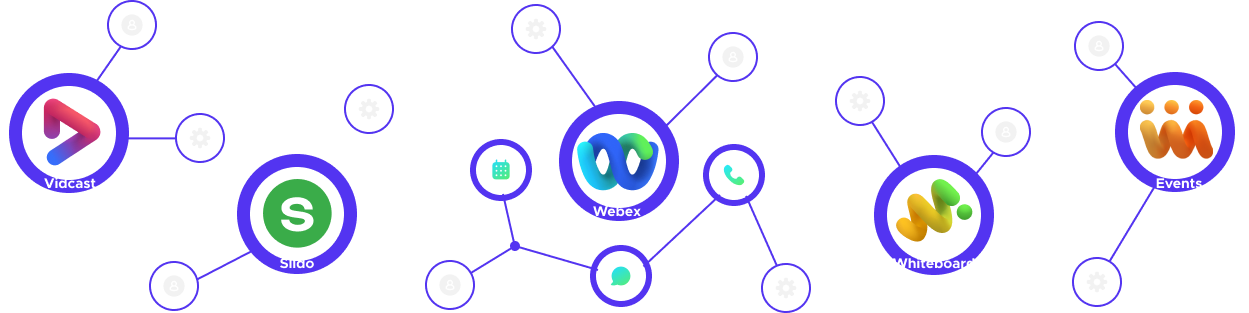
While Cisco had acquired several powerful and engaging tools with natural overlapping use cases, each product was built as a stand-alone application. This meant that each product had its own account settings, user profile, and unique user interface, the apps needed a common denominator that would visibly connect them for the user and highlight how the apps complement each other and add value to users as a suite of products.
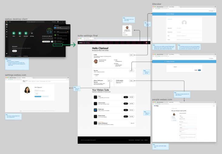
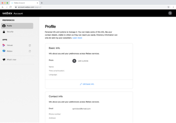
To lay the foundation for a unified suite experience we decided to centralize the common settings into a global account where users would populate profile and security settings across the apps in their account. The layout needed to be flexible and scaleable enough to account for different user permissions and a wide range of use cases.
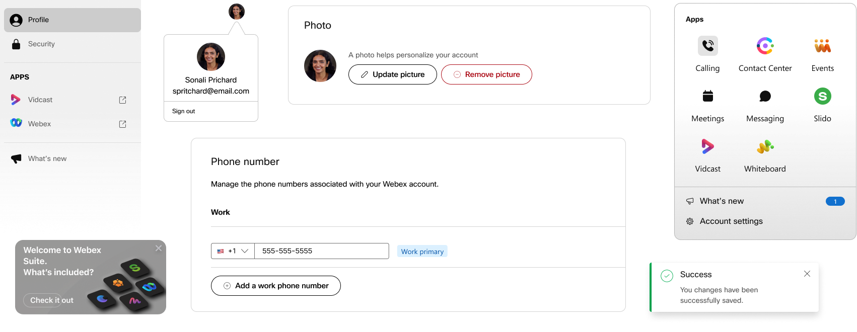
To provide the needed flexibility we created a modular card system where each module would hold one input type. By limiting each card to one input type we would be able to add and remove cards based on permissions configured by the admin without disturbing the overall integrity of the design. Furthermore, the modular approach would provide other teams with a framework to operate within, allowing other product owners to continue to build and iterate without being a bottleneck.
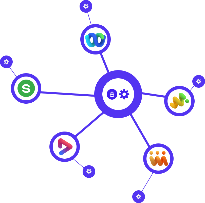
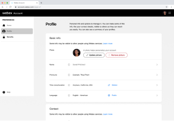
The new model would centralize profile, security, and common settings under a new account experience. This information would update globally across the apps in the user account, whereas settings specific to each app would remain editable directly in the native apps. This separation would provide the common denominator we wanted without disturbing critical workflows within each app.
Once we had alignment on the strategic concept we started to research and iterate, looking at user types, use cases, the competitive set, as well as the technical and resource limitations we were facing. Insights were used to create prototypes, those prototypes were used to drive discussion, and we began to outline opportunities for quick wins and develop our north star goals.


Starting with the user in mind I looked at the key differences between our two main user groups. I found that the groups had completely different starting points which would greatly impact the first-time experience. For SMB users the FTE would need to focus on building up value for the user as their team and business grew, whereas enterprise users were looking to increase productivity and collaboration where teams and workflows were already established.
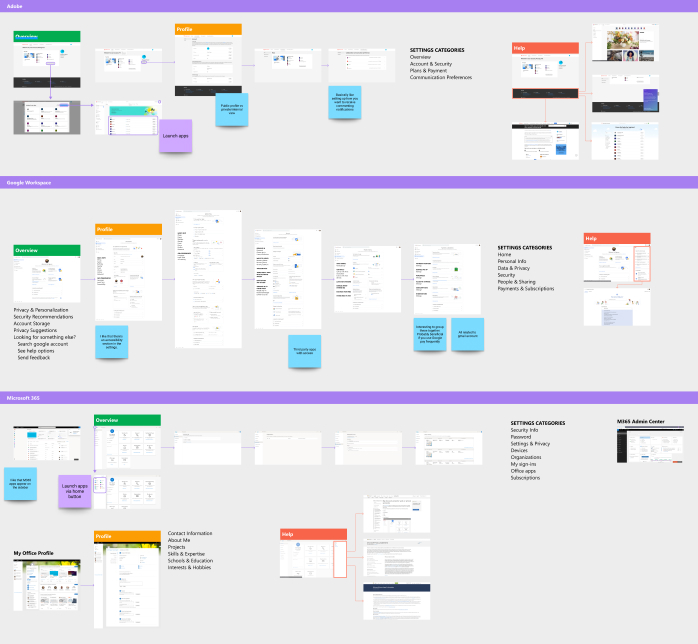
When analyzing the competitive set we looked at account experiences from well-known companies like Adobe, Google, and Microsoft. While examining user flows from similar products provided great examples of UX practices, a crucial takeaway came from noticing how those experiences differed from one another.
Imagining the WHY behind design decisions in the competitive set enabled me to build an experience with our own WHY at the center and tailor our experience to highlight how our products uniquely solve the needs of our users.
With multiple sites and products coming together, there were plenty of scenarios to account for so I started to map out and note the different dependencies for the digital properties we wanted to consolidate.
As a contractor, this helped familiarize me with the ecosystem and provided a reference I could use to contextualize discussions with product owners. This internal research also helped surface questions that would reshape priorities, clarify the magnitude of project scope, and inform design decisions.
Throughout the process, we quickly created and updated designs and prototypes based on feedback from leadership. Circulating these prototypes proved invaluable as some teams were in different time zones and we needed to ensure stakeholder buy-in. This was particularly valuable when determining our target audience for the initial release.
Initial concept circulated through leadership to get alignment and early stakeholder feedback.
Alternate layout option focusing editable fields to one area.
Stacked layout iteration to declutter the page and provide more whitespace to improve future scaleability.
Grouping input types into themes to allow enterprise users the convenience of editing multiple fields within related field types.
Adjusting the interaction points to align with established style guides and design patterns.
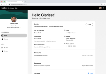
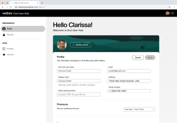
A north star version representing a move from a settings-focused site to a product and feature-focused experience.
Besides the new account and settings experience, a net new component that needed to be designed was an app switcher that would allow users to navigate through their product suite. Dubbed the Waffle Menu, I began by mapping out the user flow to see how the menu would display in other apps and where users would land when switching from one app to another.
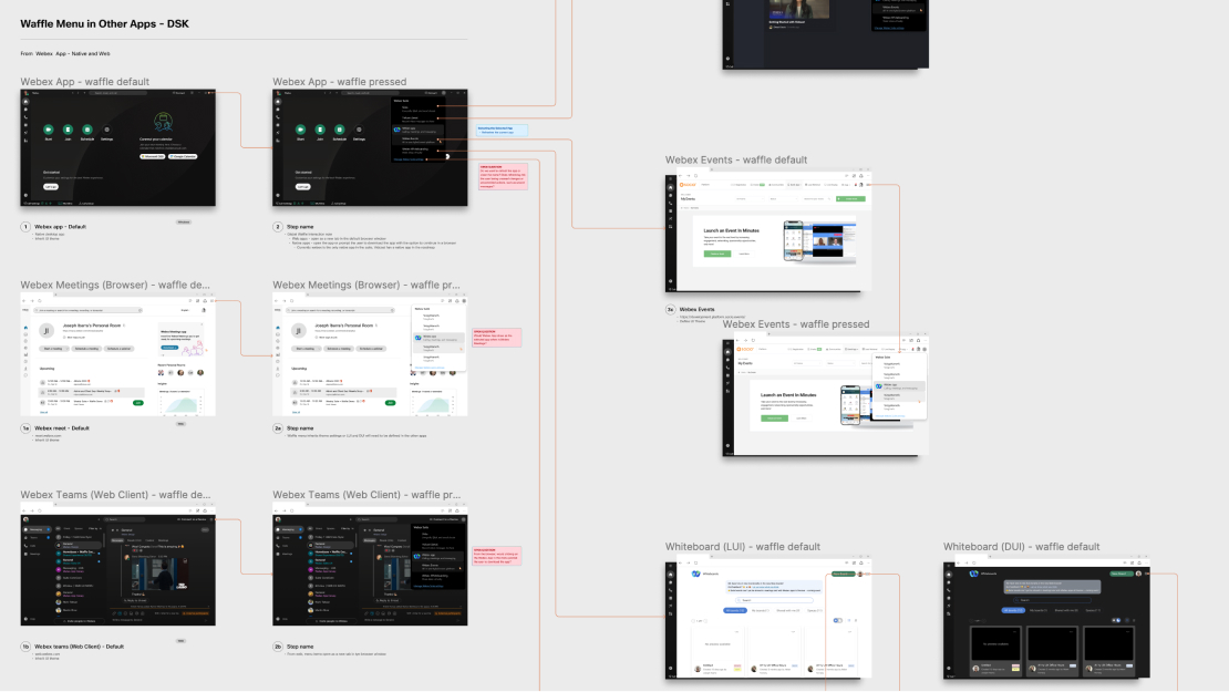
In addition to switching apps, product owners wanted to explore how to leverage the menu to expose other engaging and value-focused information such as update notes, user education, and recent activity.
Accounting for all of these initiatives would require exploring some inventive layout treatments. Ultimately the options I presented would illustrate a need to simplify and prioritize what we wanted to surface in the menu and what was better served in other areas.
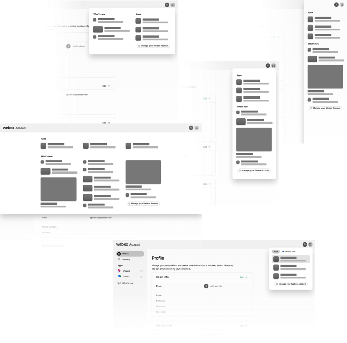
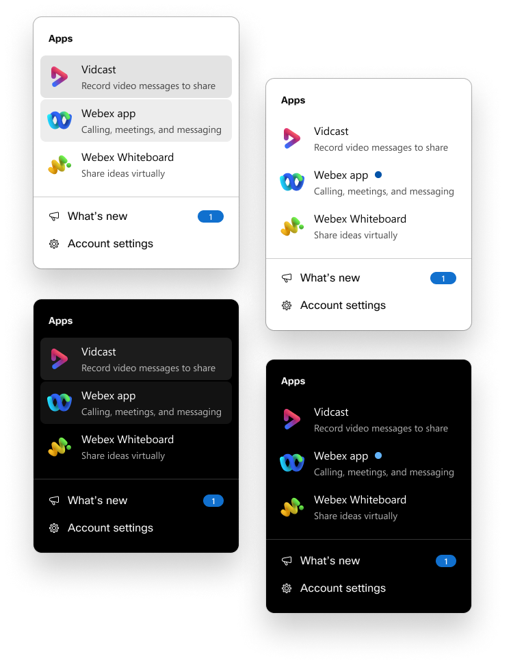
Initial concepts of the waffle were focused on presenting a small set of apps. Taking into account that users might not be familiar with the apps and their functions we used taglines to highlight how each app added value to user workflows.
This stacked approach to the experience, delivered the main function of app switching while addressing user education, and providing waypoints to other initiatives like account settings and product updates.
A drawback to the stacked experience was that it lacked scalability, this became evident when leadership wanted to add more items to the app list.
The longer the list became the more cluttered it appeared, causing the taglines to lose their effectiveness. Removing the taglines caused the layout to feel unbalanced due to the poor economy of space.
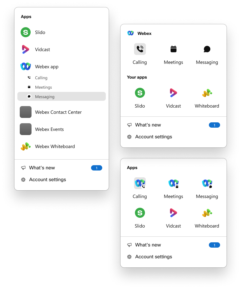
To remedy this, we decided to go with a grid approach. Besides being visually balanced, the grid was easier to scan, reducing cognitive load by breaking up apps into lists of three rather than a long list of potentially eight or more.
In the end, we deployed two versions of a settings-focused Account experience which were released to free users, and found that users were signing up for exploring the apps in their suite through the waffle menu. Our last version of the design accounted for a pivot in overall direction to account for settings and functions because leadership decided to sunset the existing meetings site and the online version of the desktop app into the new account experience.
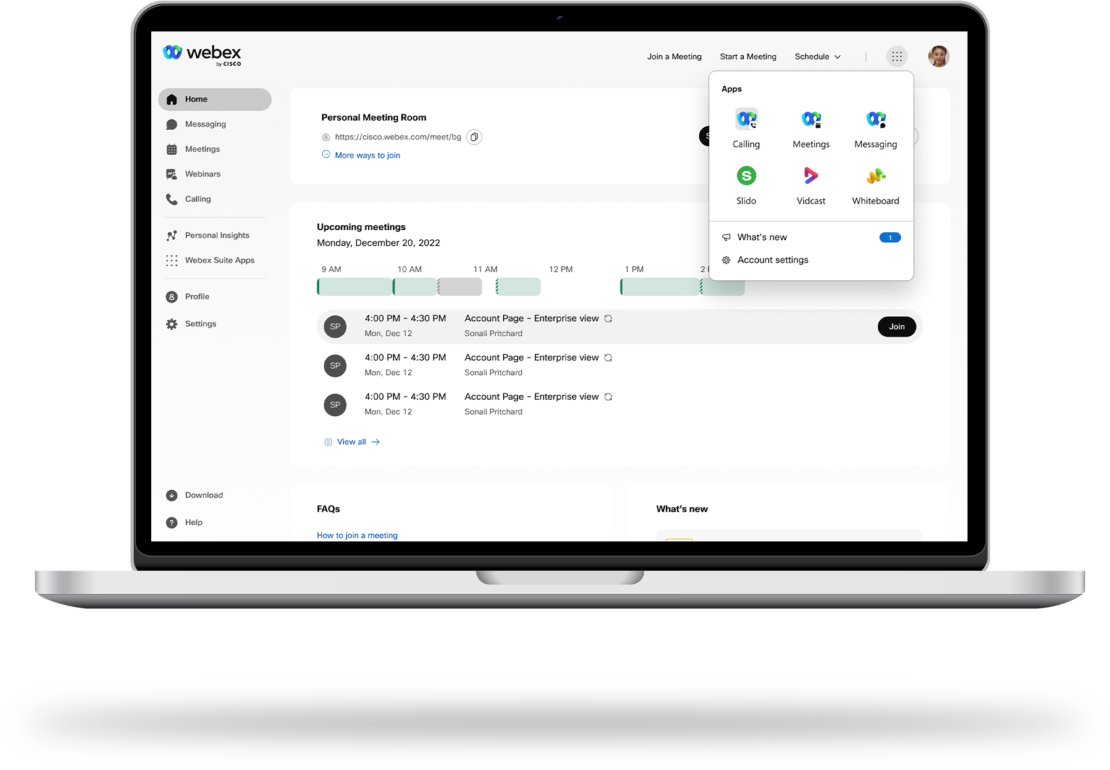
Example of the proposed concept housing settings, and features for online users. Final designs under NDA.
My experience with this project provided many challenges and I found that working with a highly iterative approach helped when managing fluid project priorities. Although the final metrics and designs can not be shared until the product is released publicly, I would like to share three of my top takeaways that I believe will make me a better designer in the future.
takeaway
Technical Restraints
Technical restraints will likely impact design choices, It's important to be aware of any limitations in the backend architecture to ensure designs are practical.
takeaway
Build the Problems
You may not always be the SME in every area of a new project. Building your questions into your designs/prototypes is a great collaboration tool.
takeaway
5 Why’s
Assumptions present as little to no ideas or too many ideas. Challenge your perception of the problem by questioning your design choices.
I hope you enjoyed this project. Feel free to reach out for collaborations or just a friendly hello.
Have a great day!
